Marketing • 9 Minute Read • Jun 28, 2024
5 Tips to Create a Great Product Page

Kelcie Ottoes, Writer

We’ve all ended up on a product page for something we desperately need… but end up not making a purchase because we can’t find the right information. When this happens, our next move is often to find a vendor who can provide us with all the information we’re looking for.
Bad product pages push away your most interested and engaged customers right before a sale.
Your website and your business can’t reach its full potential with a scattered, lackluster, or half-baked product page. Below are five tips that can help whip any product page into shape and give customers an exceptional experience when shopping with your brand.
What is a product page?
A product page is a web page on a company’s website that showcases a specific product to help buyers determine whether the item or service is a good fit for their needs. It helps potential buyers envision the product in their hands, in their home, or put to use. Great product pages communicate a clear value proposition, and often suggest related products as a cross-sell or up-sell opportunity.
Brands can create engaging and helpful product pages by:
- Creating intentional web designs
- Showcasing the product in photos and videos
- Providing detailed descriptions
- Highlighting reviews
- Making the check out process seamless
Tip #1: The Design Should Match the Product
The design of a product page tells buyers a lot about the product and the brand. Ideally, your product pages create a virtual experience and help people determine if your products or services are right for them.
The information that’s most important should be bigger, bold, an easy-to-read-color (not yellow or a soft pink), and easy to find. Normally, photos and videos are on the left and text to the right. Expandable sections help buyers find the information they’re looking for and skip the information they don’t need. Each design decision should push customers to the next step.
Also, consider making room for white space. The more white space you have, the higher perceived value of your product. For example, walking into an Apple store doesn’t feel the same as walking into a Best Buy. Same with visiting a thrift store compared to Gucci. Use white space and color to showcase the kind of brand you are, be it a state-of-the-art thought leader or an affordable option for everyone.
Create consistent design throughout all of your product pages so finding new information becomes second nature and thoughtless.
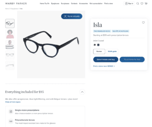
The Example: Warby Parker
Warby Parker’s website makes purchasing new glasses easy. At the top of their product pages, they showcase the cost, colors, and how to make a purchase.
Further down the page, they highlight details and have expandable fields to find the information you’re looking for. You can also try on glasses virtually or consider frames that are similar to the product page you’re on.
Tip #2: Photos and Videos are a Necessity
While your product may not be worried about you capturing it’s, “good side” consumers are worried about checking out every angle. And when we say every angle, we mean every angle. Many shoppers prefer to see a 360-degree image to ensure the product they are purchasing is a great fit.
Yet, 360-degree images may not be an option for every brand, so you can supplement with product photos, lifestyle photos, and videos of your product or service in action.
For product photos, consider using a neutral background while keeping the product in focus. Use clear, large images that capture all details. Lifestyle images should showcase how the product is used in real life – albeit a more glamorous version of real life.
Photos and videos should showcase the product range, what makes your item different, and the sizing.
You’ll also want to let buyers upload their own pictures – which can build trust with prospects. You would be hard-pressed to find a major brand like Target, HomeDepot, or WayFair that doesn’t let people upload photos of their products.
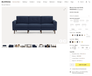
The Example: Burrow
Burrow uses videos throughout their product page to showcase different aspects of their couches. For example, a martini sways back and forth but the text reads, “don’t sweat the spills”. A pillow fight ensues in one video with a note on the couch’s durability.
And, the couch magically goes from a couple of boxes, to a comfortable and stylish couch in a matter of seconds – showcasing the overall ease of ordering and assembling.
Tip #3: Include Every Little Detail
Being a great sales person isn’t about pushing a sale at all costs. Rather, it’s about presenting the right information to the right audience. Start by talking to your audience’s pain points. Empathize with the frustration they feel with this item lacking in their world.
For example, if you sell rugs, a paint point could be waking up and walking across cold floors. Or maybe their kids leave water all over the bathroom floor, creating a slipping hazard. Speaking to these pain points can help the people looking for your products feel like, “This brand gets what I’m going through. I need this product.”
-
- Use descriptive titles: Pick a title that is clear and specific to the product. It should also match your SEO title.
- Let the details shine: What the product is made of, how it’s assembled, or any unique selling points should be noted and easy to find.
- Make it skimmable: Utilize bullets, bold texts, and font sizing to highlight what’s most important.
- Let your personality shine: Your brand may be detailed, professional, unexpected, funny, dark, or weird. Bring that personality to your product pages.
- Make options clear: Sizes, colors, additions, and customizations should be easy to find.
- Suggest other products: A product page is an ideal place to cross-sell and up-sell, increasing average order value.
- Include a FAQ: This is a great place to accordion fold information to share lots of details without overwhelming people with too much text.
- Note what’s not included: This could be an up-sell or cross-selling opportunity if you sell additional products that are needed for the initial purchase, like a lamp and light bulbs.
- Showcase certifications: If you’re a member of 1% for the Planet, B-Corp Certified, or have any other relevant certifications for your products, showcase them. These certifications can help build trust and transparency when it comes to your products.
- Include technical information or spec sheets.
Keep in mind, the more expensive your product the longer your product description should be to help customers overcome doubts.
If your product is out of stock, but will be restocked, make it easy for customers to sign up for restock information. Providing a restock date is also helpful for back ordered items.
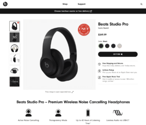
The Example: Beats by Dre
Spending $100 to $300 on a set of headphones is a significant investment for most people. That’s why the Beats by Dre product pages include every single piece of information to help someone decide, “Are these the right headphones for me?”
Tip #4: Reviews Sell the Product For You
If a good friend recommends a restaurant or a book to you, you’re more likely to try it out – right? Well, think of every customer you’ve had as a new friend for potential customers. 88% of people trust reviews like they do a recommendation from a friend. And, nine out of ten customers read reviews before buying.
Creating a space on each product page where your customers can honestly share their experience, answer questions, and upload photos help folks who are interested in your product determine if it’s the right fit for them.
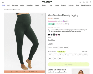
The Example: Girlfriend Collective
Girlfriend Collective uses reviews and customer photos to build trust with potential buyers. Given that they have hundreds of reviews on each product, they also have set up a smart filter to help buyers find the answers they’re looking for like: compression, stretch, and fit.
Under their customer uploaded photos, they cute-ly note that the leggings, “Look Better On You”. The user uploaded content showcases what the leggings would look like if the buyer was wearing them and was out doing fun activities – like the customers that already bought these leggings!
Tip #5: Make Payments Easy
The last place you want your customer to get confused is when it comes to the payment. How heartbreaking would it be to lose a sale as someone is trying to give you their credit card information?!
There should never be any confusion around placing an order. All customizations should be clearly outlined and easily to select, including what products are and aren’t in stock. You can also offer multiple payment methods like PayPal, credit cards, or ShopPay.
Somewhere below the clear ‘Add to Cart’ include the fine (or not so fine) print of your shipping details, refund, and return policies. This can help ease a potential customer’s mind that the product will make it to them on time, and if they don’t like it they can get (all or some) of their money back.
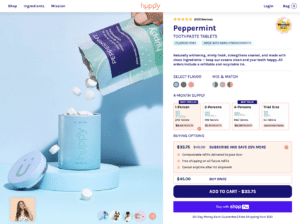
The Example: Huppy Toothpaste
Huppy Toothpaste is a toothpaste tablet company looking to rid the world of toothpaste container waste. They also have a quick and easy checkout process. At the top of the page, you’re able to pick which flavor you want (or mix and match).
You’re also able to pick how many people you’re buying toothpaste for, with helpful descriptors like ‘Most Popular’ and ‘Best Savings’. These options also include a price difference based on quantity. Last, potential customers can either choose a one time purchase or subscribe and save with two different payment options.

Great Product Pages are a Gold Mine for Ecommerce Businesses
When customers find their way to your product page, the text, visuals, design, reviews, and checkout experience should all suggest, “This product was made for you.” Their doubts should be quieted, their questions should be addressed, and their next steps should be clear. Afterall, a product page is a terrible thing to waste. Don’t lose customers on the last step of their journey.
Being an ecommerce business owner can feel more lonely than a Taylor Swift breakup album. That’s why we created our newsletter, to connect with like-minded ecommerce business owners and provide them with helpful information to propel their business forward.
Sign up now at the bottom of this page to get more helpful information, like this blog post, straight to your inbox.
Similar Articles

Entrepreneurship, Marketing, Productivity•11 Minute Read
6 Ways Your Ecommerce Business Can Hire Help

Ecommerce, Entrepreneurship, Marketing•10 Minute Read
How to Leverage Social Media for Your Ecommerce Business in 2025

Ecommerce, Marketing•6 Minute Read